Newer logos

Please register or login

Welcome to ScubaBoard, the world's largest scuba diving community. Registration is not required to read the forums, but we encourage you to join. Joining has its benefits and enables you to participate in the discussions.

Benefits of registering include

  • Ability to post and comment on topics and discussions.
  • A Free photo gallery to share your dive photos with the world.
  • You can make this box go away

Joining is quick and easy. Log in or Register now!

sappnasty

Contributor
Messages
78
Reaction score
6
Location
Daytona Beach
# of dives
25 - 49
Again, Please give me your thoughts....the name in the first picture is just made up but to show what the logo would look like with text......i totally redesigned thhis first logo....using some of your criticism....I got rid of the crazy scuba skydiver...and replaced with a horizontal figure......I added some sea bottom, a sponge and a few fish....and used the dive flag as the background.

The second logo is a different diver with the same compass rose...just different colors. I removed the sharks teeth so that it wouldn't be so busy as some of you suggested. Let me know what you think of both of them. I can only continue to make it better with your criticism...cause let's face it....your all divers and this is the thing that we all love.....

Thanks,
Michael Sapp
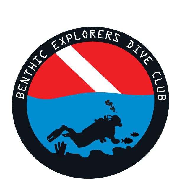
DIVECLUB3.jpg

DIVECLUB2.jpg
 
I certainly love the first logo! It's the best! Simple, yet to the point of the Dive Club!!

Good job!!

By the way, where did you get the picture of the scuba diver? Designed it yourself? If so, how? I am learning Photoshop so I wanna learn! =D
 
I prefer the first logo. The compass rose makes the second logo too dazzly.

I'm not thrilled with the split fins, the danglies on the diver or the text font.

Other than that....
 
first one ..but how about eliminating the diver altogether?
 
Again, Please give me your thoughts....the name in the first picture is just made up but to show what the logo would look like with text......i totally redesigned thhis first logo....using some of your criticism....I got rid of the crazy scuba skydiver...and replaced with a horizontal figure......I added some sea bottom, a sponge and a few fish....and used the dive flag as the background.

The second logo is a different diver with the same compass rose...just different colors. I removed the sharks teeth so that it wouldn't be so busy as some of you suggested. Let me know what you think of both of them. I can only continue to make it better with your criticism...cause let's face it....your all divers and this is the thing that we all love.....

Thanks,
Michael Sapp
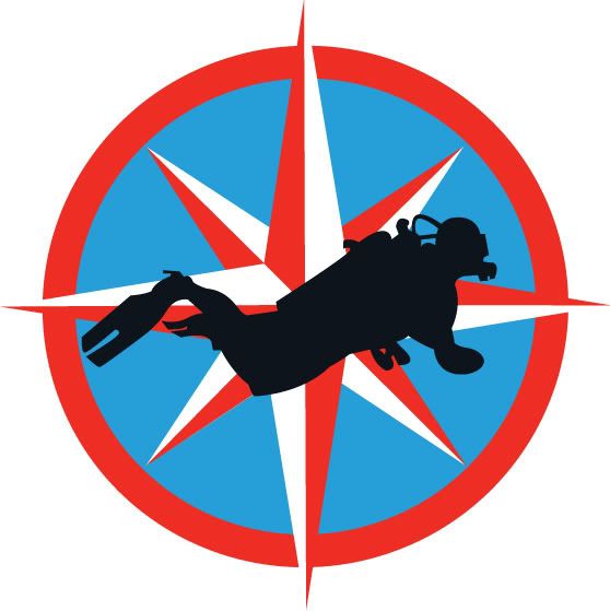
DIVECLUB3.jpg

DIVECLUB2.jpg

I think the first one is fine the way it is. You did a nice job. The second image with the compass rose is too busy.
 
i still say dive flag is enough, get rid of the diver
 
I like the first one a lot. I agree about the danglies, they gotta go. I don't know about getting rid of the diver, though. What would decide for me would be the focus of the club. Is it comprised mostly of people who want to explore the under water world and for whom diving is just a means to an end? If so, the diver is not necessary. If, however, the members concentrate on diving as a sport and consider the scenery as gravy, then the diver is very appropriate. Hmmm.

I didn't see this thread till after I posted on the other one. Ooops.

Jim
 
LOVE them split fins. Now a big dry snorkel with that big funnel thing on top. Have it looks like he's swimming with his arms, and his legs in a bicycling motion.
 
First one is really nice! Good work. Second one is ok, but not a patch on the first one :)
 
https://www.shearwater.com/products/peregrine/

Back
Top Bottom