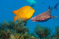
What would you do to fix this?

Please register or login

Welcome to ScubaBoard, the world's largest scuba diving community. Registration is not required to read the forums, but we encourage you to join. Joining has its benefits and enables you to participate in the discussions.

Benefits of registering include

  • Ability to post and comment on topics and discussions.
  • A Free photo gallery to share your dive photos with the world.
  • You can make this box go away

Joining is quick and easy. Log in or Register now!

Chocula

Registered
Messages
56
Reaction score
10
Location
Southern California
# of dives
50 - 99
What post production should be applied to improve this shot? What is attached reduced in size and converted to jpg from the raw file, then compressed as it was uploaded, no other changes made yet. The compression artifacts around the Garibaldi don't exist in the raw file and the back scatter shows up a little more. I am familiar with how to do most editing, but I am looking for suggestions on what I should do before I have this printed.

Thanks!
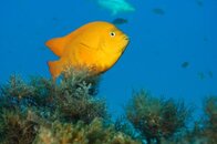
Catalina_006.jpg
 
Depends on the look you're trying to achieve. What do you want to accomplish?
 
Depends on the look you're trying to achieve. What do you want to accomplish?
I print very few of my pictures and I want to make the most of those that do get printed. The end goal is an aesthetically pleasing picture to hang on my office wall that reminds me to go diving more. Ideally it will be pleasing to others as well and not just me.

Edit from the RAW file and don't reduce the size at all if you want to print it.
Yes, the size was just reduced to keep it a reasonably viewing size on the forum.

Thanks,
Chocula
 
I print very few of my pictures and I want to make the most of those that do get printed. The end goal is an aesthetically pleasing picture to hang on my office wall that reminds me to go diving more. Ideally it will be pleasing to others as well and not just me.

What I mean is, do you want the colors to pop? Do you want it to look like an HDR image? Etc.

Simply saying aesthetically pleasing means so many different things to different people. Really, if you don't know what you want, just play around with it in Lightroom until you're happy.
 
I think I'd either clone out the background fish entirely or make them pop more.

Otherwise, just move contrast, highlights, shadows, whites, blacks, color balance, hue of your yellows oranges reds abd blues, and saturation of the same. I like fish to pop off the blue background.

Nice photo!
 
I'd resize the photo to portrait instead of landscape, bump up the contrast and vibrance a little. Looking at it from my phone is kinda tough to see if more needs done. Just make sure you give the fish something to swim into on the right. Don't center the fish.
 
https://www.shearwater.com/products/perdix-ai/

Back
Top Bottom