


As far as accessibility and performance goes it works fine. It doesn't properly scale though. It's because of hard coded pixel sizes. They happen to have one that is the same as your device, but not mine. Look at the code snipped I posted above.
Here's how it looks for me:
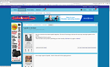
You guys could edit that CSS file and change references like "max-width: 1200px" to "max-width: 100%". This way anyone with a display that shows more than 1200px will get 100% of their display filled, but it won't extend beyond the range of the display necessitating scrollbars.
Or you could consider asking xenforo support about it. They may be willing to make the change in a future revision of the software.
Honestly I didn't MEAN to hijack the thread. It's only a minor annoyance. Sorry if i caused you guys any heartburn.
Here's how it looks for me:


You guys could edit that CSS file and change references like "max-width: 1200px" to "max-width: 100%". This way anyone with a display that shows more than 1200px will get 100% of their display filled, but it won't extend beyond the range of the display necessitating scrollbars.
Or you could consider asking xenforo support about it. They may be willing to make the change in a future revision of the software.
Honestly I didn't MEAN to hijack the thread. It's only a minor annoyance. Sorry if i caused you guys any heartburn.
