SURPRISE!!! Dive-O-Rama Banner Studies

Please register or login

Welcome to ScubaBoard, the world's largest scuba diving community. Registration is not required to read the forums, but we encourage you to join. Joining has its benefits and enables you to participate in the discussions.

Benefits of registering include

  • Ability to post and comment on topics and discussions.
  • A Free photo gallery to share your dive photos with the world.
  • You can make this box go away

Joining is quick and easy. Log in or Register now!

thats pretty good. i agree with paolo in regards to the hairstyle, maybe we can make the background a bit livelier? it looks like an invitation to a masquerade ball:) i like the style, how about a change of apparel as well? something like beach attire more appropriate for our philippine settings? like:

1.sandals or you can goof it up a bit by combining the fins
2. board shorts with gumamela or hibiscus designs? a lot of hawaiian motiffs, straw hat,
3. you can have the philippine map watermarked in the background with faded effect, that way you are recognizing the philippines without the jeepney or the flag.
4. you can even add sealife or wildlife in the background. lets make :)
 
shugar:
hahahaha hi iris - welcome to the club! (or are you also iris_baula only hiding behind a secret identity)?

Jag

yeah, it's me. changed my username :D since our mascot's a guy, come on let's add something feminine naman. pink hair please :wink: or pink platfrom fins :D
 
one posting nalang reply ko on your inputs... 1st of all, salamat sa comments...

ok... will see what i can do in the next couple of days... i just had my student draw this for me so it will take a slightly longer process to change certain elements...

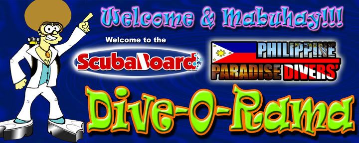
re platforms: i'll be inputting the platform fins very soon... i missed out on that 70s detail e... baby pa kasi ako nun hehehehehe

re hair/ clothes: if i overhaul the whole look/outfit it won't be a disco dude anymore... and the platform fins won't match (mumukha lang siyang tanga)... i went with the disco dude look to complement the retro feel of "dive-o-rama"...

re SB/PPD logo: i can make the SB logo bigger, no prob yun... yung PPD is a different thing... alanganin ang haba ng name, plus no brainchilds on my part on how to "logo-ify" it... will do what i can

re color: i took depth actually into consideration when i did the colors. 1st of all kailangan retro theme (again, thematic ang tirada ko) so i had to use the tertiary color combos that were a hit during that time... because i opted to use bright foreground colors i have to use a dark background to create a contrast... i tried doing a much more colorful and psychedelic bkg kaso nalunod lahat ng elements... i tried white... sorry... just sooooo bleh... i also calculate that with a relatively dark background, it will actually disappear underwater! that means that all you'll have left as the most dominant visuals will be disco dude and the text... cool huh?

re depth: have we decided at w/c depth we're taking a group pic? hahahahaha... just the same, i will want a photo topside also so we don't lose out on all the elements... also, kung nasa 10+ or 15+ tayo, i don't know how decently we can coordinate a group pic

re RP representation: i'll see what i can do with regards to the flag... baka stylized or something...

re butanding: hello? ano gagawin natin sa butanding??? hahahahahahaha

re sealife/wildlife/other elements: too many elements na... might become too busy to be effective

re female: i've asked my student to see if she can whip up a female... no promises pa daw... thesis kasi siya e

re pink hair: hmmmmmm............. ganito nalang, iris... if no one echoes your call for pink hair (wala namang pink hair nung 70s a... meron ba? pao, meron ba nun?) then i will send you a jpg file of the disco dude with pink hair... just for you :D

re baby: i'd like to replace it with something pa rin... parang pag "welcome" lang medyo boring... again i'm thinking thematically here... i can replace the whole thing with "mabuhay" para medyo mas local pero wala lang... nagiinarte ako? hehehehehehe i don't know if i'm just in austin powers mode with this thing

that's all i guess for now... i'll try to do these over the next couple of days... wag lang masyadong matagal sa concensus mga kapatid, next week na ito

Jag
 
shugar:
re baby: i'd like to replace it with something pa rin... parang pag "welcome" lang medyo boring... again i'm thinking thematically here... i can replace the whole thing with "mabuhay" para medyo mas local pero wala lang... nagiinarte ako? hehehehehehe i don't know if i'm just in austin powers mode with this thingJag


" WELCOME - MABUHAY " i think would set it to the local theme setting

at Php40/sq. ft X 3ft X 4ft = php480.00 pesos. what if we do two banners. one with dark Bg, one with light BG. sagot ko na yung light colored BG. pledge of php480 for the light colored BG.
 
shugar:
5x2 and design ko nito... P400 at 40/sqft =)

cheaper... sige i'll make you a light colored one... vert o horizontal?

Jag


just 3ft x 4 ft horizontal .

can you make it top left (SB logo)
center spread out across Philippine Paradise Divers
top right "welcome" diagonally from top to right , parang ganyan --> " \ "
then bottom left "Mabuhay" to right edge, parang ganyang ---> " / "

kung pwede lang, trylang yun layout sa attachment kung pwede, but kung magulo, k lang.
 
this is based on some revisions...

THIS ONE really just incorporates the platform fins as well as some changes to the size of certain elements

dive-o-rama-banner-study5.jpg


this one is the same thing with a lighter background...

dive-o-rama-banner-study3.jpg


this one uses a multi-colored/ lighter background but retains the same elements...

dive-o-rama-banner-study4.jpg


you will notice also a "new" PPD logo... i got to incorporate the phil phlag somehow... i hope you guys don't think it's tacky...

thanks... sorry bumagal ang turnover... daming work... kelangan pang maningil kung hindi snorkeling lang magagawa ko dun heheheheh

Jag
 

Back
Top Bottom