underwatermatt
Registered
- Messages
- 9
- Reaction score
- 2
- # of dives
- I'm a Fish!
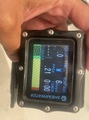
Is there a default tissue load on the shearwater graphs or can anyone think of a reason my tissue charts would be this high after 6 days out of the water? Even after a long dive trip (5 weeks, ~2-5 dives a day) there’s no way I would have this much residual nitrogen. Also, why would all compartments be equal? It seems to default to that even after an afternoon/ night out of the water, when I would think the fast compartments should be empty and the slow compartments still have a bit. Side note, but does anyone know how to pull the old tissue graphs out of the computer’s memory? I have a few dives I would be curious to see (yes I know it’s a theoretical model that means little but I want to see if the model matches with certain real world things)