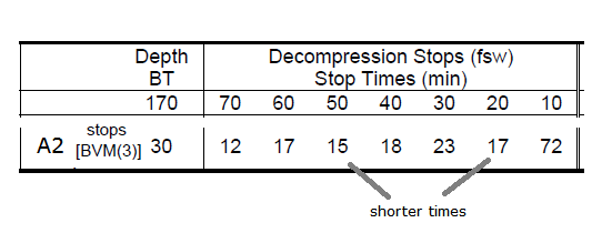
Please see the heat map below. It provides a comparison of the supersaturation patterns of 4 profiles -- the 2 NEDU study profiles (A2 and A1) and two models we're all more familiar with, VPM-B and GF. Both VPM-B and GF were dialed in to have the same runtime (209 minutes).
(.....)
The heat map shows visually what Dr. Doolette's "deep stop skew" chart showed conceptually. A2 and VPM skew stops deeper and GF and A1 skew stops shallower. The impact of this skew is seen in the integral supersaturation (ISS) chart below. ISS is an index of time exposure to supersaturation. The only credible theory for the higher DCS rate in A2 is that it's higher integral supersaturation (i.e. diver's exposure time to supersaturation) caused the additional DCS risk. For reference, VPM's ISS is 95% of A2's, GF's is 84% and A1's is 80%.
The nice thing about these charts is WE KNOW the risk of A2 (~5%) and A1 (~1.6%). And you can see the relative similarities of VPM and GF. Many of us have concluded based on these NEDU results that VPM's mechanism of allocating stop time simply allocates too much time deep. And GF's algorithm more naturally skews time in better proportions to shallower depths and, therefore, better reflects the NEDU study.
As much as I like the heat maps and ISS concept, I see how difficult it may be for some to grasp the whole thing. The argument of similarity in ISS will always be countered that the actual profiles (fsw,min.) do not "look" similar whatever that means. That's why I brought up the table above, to let the models (VPM, ZHL+GF, ...) decide if a profile is good or bad. In this way we can correlate each model response directly with the experimental result and need not argue about a metric for similarity of different profiles.
Would you mind checking with your VPM software, whether A2 and A1, when entered as multilevel dives, hit the ceiling? Is there any conservatism setting (ICR) that get's the right answer (A2 hits the ceiling but A1 doesn't)?