Critique and Criticism needed on this pic!!

Please register or login

Welcome to ScubaBoard, the world's largest scuba diving community. Registration is not required to read the forums, but we encourage you to join. Joining has its benefits and enables you to participate in the discussions.

Benefits of registering include

  • Ability to post and comment on topics and discussions.
  • A Free photo gallery to share your dive photos with the world.
  • You can make this box go away

Joining is quick and easy. Log in or Register now!

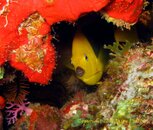
Thanks for all the constructive comments. I was indeed trying to go for the feel of where the fish lives, like him looking at me from his perspective (through his window) kinda thing. I agree that there may be too much of the sponge which does indeed deter from the fish, however, I thought the purple and brown coral were key in the lower left corner to throw in some more colours. In this one i cropped to the coral in the corner the only problem is that the subject may be a little too centered


Which do you prefer? first or second??
 

Attachments

  • Rock Beauty-2.jpg
    Rock Beauty-2.jpg
    168.9 KB · Views: 33
First, I really like the photo. My only complaint is too much red, as stated above.
I like the framing the red provides, but I'd use less and still keep as much of the other background as possible. Plus, Mr. Fish gets bigger!

As long as others are taking a shot, here's mine:
fish.jpg


Chuck
 
Ooo. I really like Chuck's version. Nice job.
 
Just my 2 psi, but I think sometime we try too much for portraits. Not every fish photo has to be a close up of the fish's face. What I liked about his original photo was that it showed where the fish lived. People who don't dive have no idea how beautiful it is under the sea. Besides, when you crop that photo too close, you can see how soft it really is.

I agree, too much close-ups looks like the fish could be in a fish tank. We should just learn from this picture and shoot two or more shots next time, first a wide angle then getting in closer for a close up. Cropping then blowing it up, after the picture is taken really takes away the sharpness of the image. My 2 cents
 
I Think by far the best version so far is Chuck's Very Very well done. Thanks A lot.. we should make this into a daily or weekly activity here in the Photo forum. Someone post a pic and everyone give's their input and suggestions. I have done nothing but learn from this thread

Thanks
 
I Think by far the best version so far is Chuck's Very Very well done. Thanks A lot.. we should make this into a daily or weekly activity here in the Photo forum. Someone post a pic and everyone give's their input and suggestions. I have done nothing but learn from this thread

Thanks

I think this is a great idea and have been thinking about how best to do it for quite a while. If there's interest, let's start a NEW thread to discuss the possibilities.

I agree - talking about an image, your own or someone else's, is an incredible resource for improving and trying new things!
 
Well, I just saw the one I submitted on my home computer (I did the edit in the car, on the laptop, in the sun)... Sorry, it looked completely different on the laptop ... yuck!
 
Ooo. I really like Chuck's version. Nice job.

same here. i like how chuck framed him. still shows the habitat but with lesser red. the play of colors is very pleasing to the eyes. :)
 
you could always just darken the red coral and briten that fish up a little bit to make it look better in photo editing you would be suprized the diffrence it can make
 

Back
Top Bottom