sappnasty
Contributor
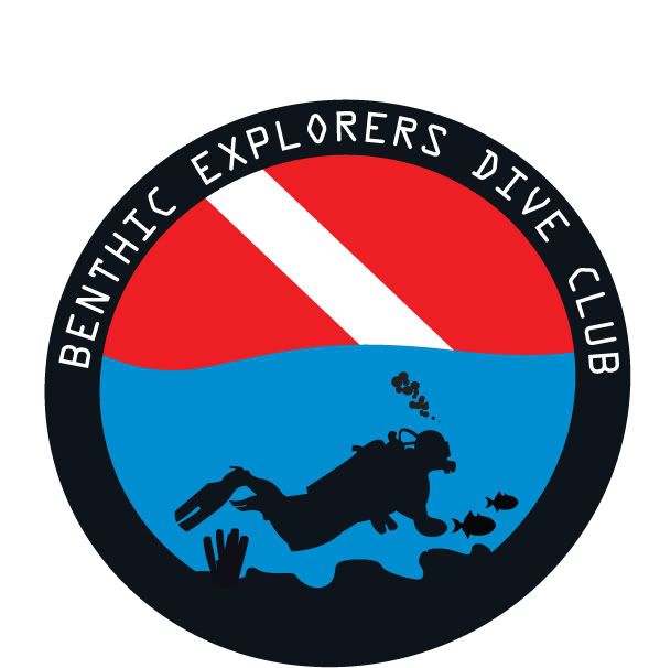
Again, Please give me your thoughts....the name in the first picture is just made up but to show what the logo would look like with text......i totally redesigned thhis first logo....using some of your criticism....I got rid of the crazy scuba skydiver...and replaced with a horizontal figure......I added some sea bottom, a sponge and a few fish....and used the dive flag as the background.
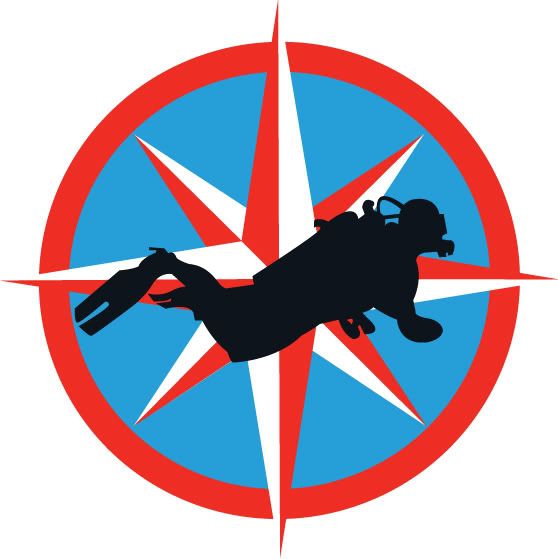
The second logo is a different diver with the same compass rose...just different colors. I removed the sharks teeth so that it wouldn't be so busy as some of you suggested. Let me know what you think of both of them. I can only continue to make it better with your criticism...cause let's face it....your all divers and this is the thing that we all love.....
Thanks,
Michael Sapp
")