I designed a dive club logo.....your thoughts?

Please register or login

Welcome to ScubaBoard, the world's largest scuba diving community. Registration is not required to read the forums, but we encourage you to join. Joining has its benefits and enables you to participate in the discussions.

Benefits of registering include

  • Ability to post and comment on topics and discussions.
  • A Free photo gallery to share your dive photos with the world.
  • You can make this box go away

Joining is quick and easy. Log in or Register now!

sappnasty

Contributor
Messages
78
Reaction score
6
Location
Daytona Beach
# of dives
25 - 49
To ScubaBoard Members,

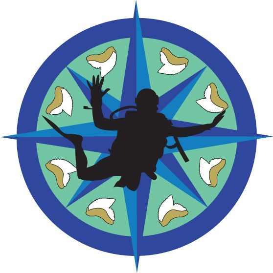
I was thinking of starting a diving club in my area since I have not been able to locate one close enough. I know that most dive clubs have logos or some sort of mascot to represent their clubs. I am currently in school for graphic design and created a possible logo for a dive club here. I designed this tonight on Adobe Illustrator and I would like to know what your thoughts are about it. I need to know if this would be a logo that any of you would put as a sticker on your vehicle, wear as a shirt, or if it would make you proud to belong? Please let me know what you think!

Thank you,
Michael Sapp
DIVECLUB.jpg
 
For newbie scuba divers, they will might not catch what the image at first which would be the shark tooth.
The person looks like he's skydiving with the SCUBA gear. LOL But I like the person anyway.
Some adjustment would suit it better. =) Maybe add some text... stating what the name is of the dive club and what city it is in. (Los Angeles, CA... Seattle, WA... etc)

But good overall!! =D Kudos for ya.
 
Overall I think it's a good start. I didn't realize those were shark teeth though, and like a few others said, my first thought about the diver was that it looked like he was skydiving.
 
Same question as when you posted this in the Conch Diver's area....

Are there many Snaggle teeth to be found in your area?

Oh, and yes, it looks like a sky diver as well...

Additionally, what significance to the background represent? If the answer is none, ditch it...
 
Overall I think the logo looks too busy, if you removed the shark's teeth altogether it would look a lot better :) Like, the colours are fine :)

Also, yes it does look like a skydiver, maybe you could have more a side on shot so it is obviously a diver?

Anyway, my 2c, very minor background in web design so take it with a grain of salt if you want :)
 
Looks good.... I would draw the diver's arm closer to the body. That way it would look less like a skydiver and more like an experienced diver.

Maybe add a buddy to the picture and have them turn more sideways...

Just my messy thought...
 
I like the look of the compass rose in the background. I would use a horizontal diver, as he does look like he is skydiving. The shark teeth make it too busy.

I would go with the compass background with a more horizontal diver. I would also like to see how you are going to incorporate the name of the club.
 
Last edited:
To the pervert, it looks like a diver trying to grab a bunch of bare breasted women.

To a nudibranch lover, it looks like a nudibranch species.

To a shark lover, it looks like a tooth.

To me, it looks like a bunch of vanilla icecream sundaes topped with butterscotch syrup, mm, mm, mmm.....

By the way, is that a split fin I see??
 
https://www.shearwater.com/products/teric/

Back
Top Bottom