Colour correction question

Please register or login

Welcome to ScubaBoard, the world's largest scuba diving community. Registration is not required to read the forums, but we encourage you to join. Joining has its benefits and enables you to participate in the discussions.

Benefits of registering include

  • Ability to post and comment on topics and discussions.
  • A Free photo gallery to share your dive photos with the world.
  • You can make this box go away

Joining is quick and easy. Log in or Register now!

With or without strobe at times you will get photos that just aren't what you "saw". I show some examples at:

http://www.authorsden.com/ArticlesUpload/24113.pdf

You don't see the backscatter until it hapens, and yes it does happen even with strobes.

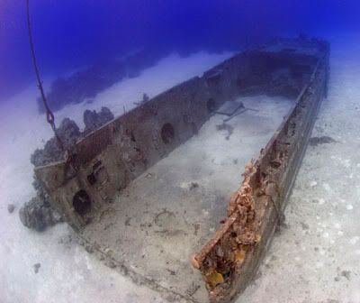
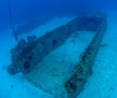
Should you adjust for levels, colors and such? Yes. I'll bet you can't show me one photo in any magazine that hasn't been color adjusted, leveled, cropped, burned, dodged or otherwise manipulated.

Maybe if you are in 10 feet of water, 100+ feet of vis with sun directly overhead you will get what you see, unfortunately that isn't were the most interesting shots usually occur.

Mike
 
I couldn't resist. Fastmarc has me going through some pictures and so I was playing around. In this case, I white balanced the ship, but only the front portion of the picture and left the distant part the natural blue. This has a little in there for everyone! :D

WhiteBalancedShip.jpg
NonBalancedShip.jpg
 
It is totally a subjective thing. I don't like the color balanced version Rich posted on page one at all - looks forced to me.

Do what looks good to YOU. You'll never please everyone and the most important person is you :) Ask anyone who has published or entered a competition - sometimes it's unbelievable what an editor, judge or people (like in popular voting) will pick as a favourite. Heck look around here when people post - some that one person likes probably leaves another cold.

Have fun!
 
alcina:
It is totally a subjective thing. I don't like the color balanced version Rich posted on page one at all - looks forced to me.

Do what looks good to YOU. You'll never please everyone and the most important person is you :) Ask anyone who has published or entered a competition - sometimes it's unbelievable what an editor, judge or people (like in popular voting) will pick as a favourite. Heck look around here when people post - some that one person likes probably leaves another cold.

Have fun!

Well.. come now.. it was forced to show a point :D Not a very good picture to begin with, but I was trying to find one that didn't have strobe in it so I could do a true white balance. Of course, once you do a white balance, that's what you get.

Anyhow, I don't like a bunch of cyan in a "blue scale" picture unless it works because the subject allows it. For example the one you didn't like, if that was darker and a silhouette of sorts, then I would think it would look great as a "blue scale" picture. That was the real focus of that post as I already know people like it one way or the other.. Like I said.. two sides of the fence. Just let me hop to the other side once in a while.. :D
 
alcina:
It is totally a subjective thing. I don't like the color balanced version Rich posted on page one at all - looks forced to me.

Do what looks good to YOU. You'll never please everyone and the most important person is you :) Ask anyone who has published or entered a competition - sometimes it's unbelievable what an editor, judge or people (like in popular voting) will pick as a favourite. Heck look around here when people post - some that one person likes probably leaves another cold.

Have fun!
Which one are you talking about Alcina? You said first page but I only have one page of posts. But I do seem to like his white balanced ones better. I guess it is just so subjective, like you said.
 
Fastmarc:
Shoot, now I'm gonna spend the whole night fooling with pics.

Fun, Fun, fun :D.

If you've got the time and or a broadband connection (DSL) head on over to radiantvista and check out their video tutorials or tutorials in text (pdf format) on getting the most out of photoshop!
I've found it invaluable...

Digital diver also has a really helpful file on using the levels tool in photoshop and getting that blue/cyan colour cast out of photos..

http://www.digitaldiver.net/lib_docs/Levels_Basics.pdf
http://www.digitaldiver.net/lib_docs/color_cast.pdf

Enjoy :).
 
alcina:
It is totally a subjective thing. I don't like the color balanced version Rich posted on page one at all - looks forced to me.
(Not specific to Rich's image). I often find that color corrected photos look artificial. A simple solution is to reduce the opacity of the color corrected layer a bit to let back in some of the uncorrected blue photo.

Similarly, I'll sometimes try two or three different methods of color correction, and then blend them back together, sometimes using luminosity from the one with the best contrast, and color from another style of correction.

As you say, it's subjective.
 

Back
Top Bottom