Colour correction question

Please register or login

Welcome to ScubaBoard, the world's largest scuba diving community. Registration is not required to read the forums, but we encourage you to join. Joining has its benefits and enables you to participate in the discussions.

Benefits of registering include

  • Ability to post and comment on topics and discussions.
  • A Free photo gallery to share your dive photos with the world.
  • You can make this box go away

Joining is quick and easy. Log in or Register now!

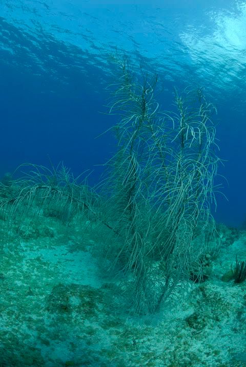
Sorry, post #10, the last shot with the black coral tree. I realise it was an illustration and I think it does a perfect job!

Working with the opacity layer is a good trick!

Fooling with things til you find something that you like on a particular image is the way to go - but it can suddenly suck several hours out of your day LOL
 
alcina:
It is totally a subjective thing. I don't like the color balanced version Rich posted on page one at all - looks forced to me.

Agree here. Definitely does a good job of illustrating the point, but think the white balance point chosen made the image overall a bit too pink tinged. I often click around quite a few spots on an image to set the white balance, and definitely have the best luck in getting what my eye sees as "natural" when I use medium gray tones to set the balance rather than what should be white. Gives a more balanced tone I think.
 
All these ideas are the reason why my photos sit in the computer, unprocessed. So many ideas, so little time, and I can never make up my mind. It's like trying to pick out a color of paint. My bedroom went unpainted for 3 years because I couldn't decide on a color.:rofl3:
Anyway, looking back at that #10 photo Alcina, I agree that the second coral tree looks a tad artificial, but comparing it to the first one, I think that one needs improving too. The dilmema is, how to do it!!:rofl3:
 
Okay, this picture is what it is.. Not a very good picture for color. But, I decided to Nikon Capture NX and do a new one since that is what I would normally use for something that needs correction. Again, I like the corrected one better (the one done with Capture NX) as I think the original is very boring. Sorry I didn't go all out on my example I used in the previous post, but geez.. I was busy at the time.. :D

To sum it up, you can do a LOT with raw and color correction or you can leave them "native". Depends on your taste, but some work native whereas many don't IMHO.

Here are the 3 versions now.

Original Picture from the Camera (shown in Post # 10)
NotWhiteBalanced.jpg


White Balanced with Aperture by just selecting a point on the sand. Nothing else, just a quick white balance. (shown in Post # 10)
WhiteBalanced.jpg


White Balanced with Nikon Capture NX by using a selection of the sand. I also pumped up the saturation a bit to bring out a few colors.
WhiteBalanced2.jpg
 
Ok....quick question, most all of my diving photos come out with a strong green hue,
can you say, "quarry diver?" I've been using PS to color correct the red. Would I be
advised to just use a red correcting lens or continue photoshopping my pictures?
My concern is, when I'm shooting in more ideal conditions I may have to go back and
remove some of the red provided by the lens.

Thank you in advance for any helpful advice!
 
Land Locked:
Ok....quick question, most all of my diving photos come out with a strong green hue,
can you say, "quarry diver?" I've been using PS to color correct the red. Would I be
advised to just use a red correcting lens or continue photoshopping my pictures?
My concern is, when I'm shooting in more ideal conditions I may have to go back and
remove some of the red provided by the lens.

Thank you in advance for any helpful advice!

Actually the magic filter people are working on a "green water" filter that you can use if you want to do natural light pictures. The other option is still to do a white balance (either in the camera or later on a RAW picture). Finally, you can shoot a strobe still, but get VERY close if your "green water" is anything like ours is here in Texas. :D
 
rjsimp:
Okay, this picture is what it is.. Not a very good picture for color. But, I decided to Nikon Capture NX and do a new one since that is what I would normally use for something that needs correction. Again, I like the corrected one better (the one done with Capture NX) as I think the original is very boring. Sorry I didn't go all out on my example I used in the previous post, but geez.. I was busy at the time.. :D

To sum it up, you can do a LOT with raw and color correction or you can leave them "native". Depends on your taste, but some work native whereas many don't IMHO.

Here are the 3 versions now.

Original Picture from the Camera (shown in Post # 10)
NotWhiteBalanced.jpg


White Balanced with Aperture by just selecting a point on the sand. Nothing else, just a quick white balance. (shown in Post # 10)
WhiteBalanced.jpg


White Balanced with Nikon Capture NX by using a selection of the sand. I also pumped up the saturation a bit to bring out a few colors.
WhiteBalanced2.jpg

Very nice rjsimp :).

Your pics remind me of some of my photos before and after I've run through them CS2 :wink:.
 
Thanks for taking the time to put up a different take on it. A very good post to show that there is no "right" way and that there are a million different ways to tweak something.

I can't count the number of times I've started to play with an image and then just lost hours and hours and ended up with five or six versions! BUT for me, this is not the norm. Usually that is on an image that didn't make the first cut anyway...my first round photos generally lend themselves to a quick tweak and a fairly definitive one so anything else I might fool with just looks wrong. For me, that works fairly well and stops me from going crazy.

Then later, I head back to the files to see what else is in there that might need some lovin'. I often find photos that should have been first rounders but that I had overlooked in my initial browse. Then again, I am terrible at getting my images dealt with - still have files from last year that aren't sorted...and still have files from when I was shooting the Oly 5050 that aren't sorted LOL
 
alcina:
I can't count the number of times I've started to play with an image and then just lost hours and hours and ended up with five or six versions! BUT for me, this is not the norm. Usually that is on an image that didn't make the first cut anyway...my first round photos generally lend themselves to a quick tweak and a fairly definitive one so anything else I might fool with just looks wrong. For me, that works fairly well and stops me from going crazy.

Exactly! That's what this picture is, nothing more than a "junk" picture that I had to show an example. I looked through some pictures I had sitting around and saw it to show. Up to this point, I never showed it to anyone :D However, IF I wanted a picture of this particular coral, I had options which is what I was showing .. :blinking:
 
Jamdiver:
Very nice rjsimp :).

Your pics remind me of some of my photos before and after I've run through them CS2 :wink:.

Thanks Jam! It was actually a failed attempt at a picture, my strobes didn't fire correctly because they saw too much light and the STUPID Sea & Sea YS-90 Auto strobes don't have a true manual mode so therefore, NO LIGHT! :light:

It would have been interesting to see it with the strobe to see what colors I could have really gotten. But, oh well.. that's why we go diving more.. :D

I will say this though.. Stingray city is a dive that I would definitely just shoot without strobes and do a white balance in post editing. You can get some killer shots doing that and so the same techniques I used to quickly do this picture, I would really use in practice for those shots.
 
https://www.shearwater.com/products/swift/

Back
Top Bottom